
Words by David C. Obenour
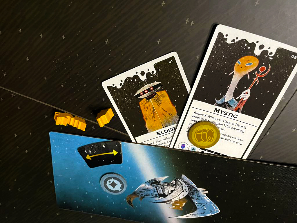
The promise of post-scarcity existence departed almost as quickly as it arrived. Races, societies, and civilizations at first thrived in this setting but the drive for power and conquest found its way back into minds and hearts and other organs found in xenos species. Generations beyond our shared failing, we remain in much the same place. Can you unify the factions of the reach to achieve peace and prosperity. Is that even your goal anymore? Was it honestly ever?
Arcs is the latest title from Leder Games and is the company’s first foray into science fiction tabletop gaming. As with other known titles, such as Root, Vast and Ahoy, the playstyle is asymmetric – offering a variety of goals, rules, and considerations inside of each game. Also related and departing for the first venture into the cosmos are the illustrations of Kyle Ferrin, Leder Games’ resident artist.
Off Shelf: For as much as Leder is known for your striking illustrations it is also known for its asynchronous style of play. As the company’s other most signature element, do you see that style of gaming playing into your art at all?
Kyle Ferrin: I think the common thread between the illustration and the game design is feeling a sense of ownership over your role in the game. Asymmetric games let you play differently from each other and unique art can help people decide what kind of role they want to play. They can hopefully identify with a character or a card and that hopefully marries well with the style of board game we’re making.
OS: Knowing that all Leder games share your art, do you ever think about or even create your own throughlines to the worlds that these games occupy?
KF: The joke we often see whenever I draw an animal in any context is “New Root faction confirmed” so I don’t think I need to make any decisions on that front. [laughs] I try to give each setting room to breath without stepping on the toes of the other settings. I suppose it’s possible to take a seagull person from Ahoy and think it could exist in Root’s world but then again, Ahoy has human characters too – and there’s a question of scale. At some point I would just be giving myself more parameters than necessary. Oath is a game with a lot of magic in it, and I think putting magic into Root would kind of botch the folksy “children’s book” vibe I’ve tried to achieve.
OS: Are there any easter eggs or carried over elements throughout the games? Things that maybe only a keen eye would pick up on?
KF: There is a tile or two in Vast: The Mysterious Manor where the art references Vast: The Crystal Caverns – but there isn’t a lot of game crossover otherwise. I will say that there are themes in how I draw certain things that carry over from game to game because of how I draw backpacks or swords. It kind of seems like a big backpack with a bedroll ends up in every property I’m involved with. [laughs]
OS: How do you see your art as evolving and refining over the years? What have you gotten better at? What are you happy to see has remained after all these years?
KF: I’ve gotten a lot better at drafting backgrounds and environments with practice and study. I like drawing characters so much that backgrounds used to be a thing I neglected. It’s kind of hard to avoid with the number of cards in our games. I hope I’m refining things like body proportions and better compositions. And that I continue to improve my understanding of color and texture.
If I had to pick something I’m pleased with maintaining I would say that I’m happy people resonate with the humor in my art. I like making people smile when they draw a card or when someone tells me they have a favorite thing I’ve drawn.
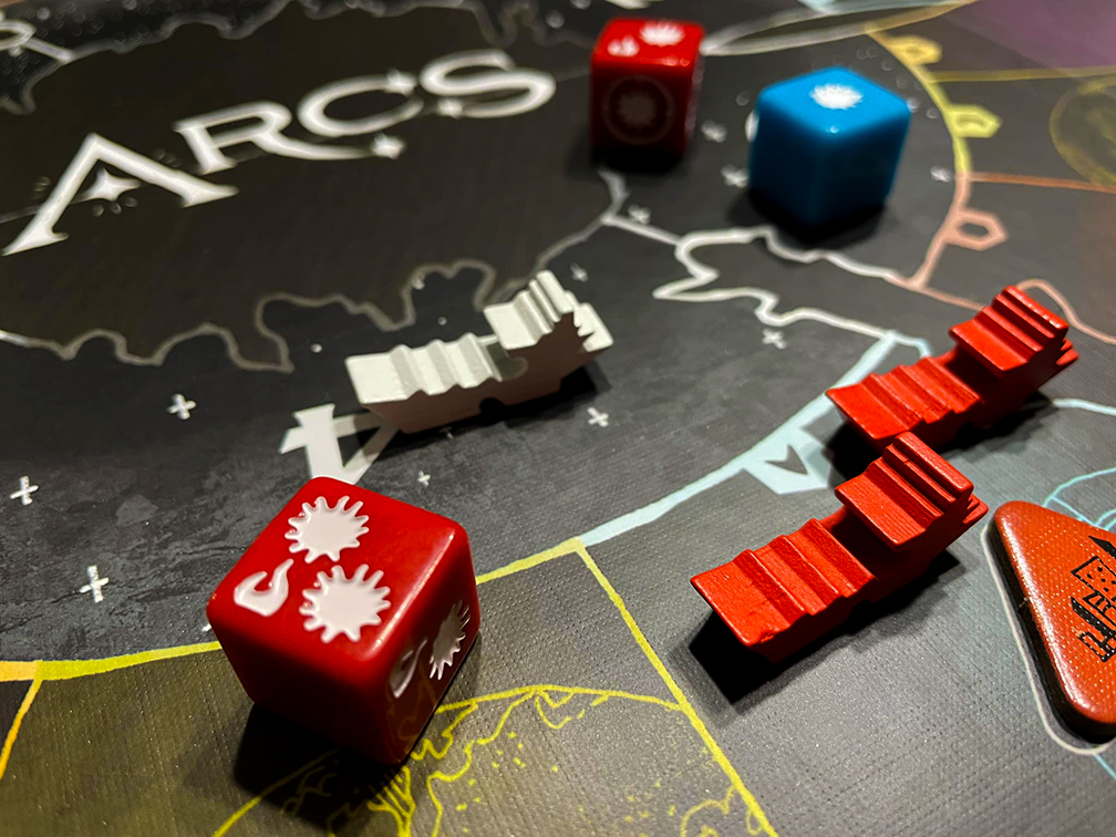
OS: I believe this is your first science fiction game. What were you excited about translating that through your own unique style? Was there anything that you felt intimidated by trying to approach?
KF: Science fiction casts such a wide net that my concern was always being too referential. I wanted Arcs to be its own thing and not be, “Kyle’s take on Star Wars, Dune, etc.” I was stoked to work on a sci-fi project so that I could add my favorite visual tropes but try also make it my own. I appreciate gritty industrial space ships and aliens with too many eyes and wild silhouettes. It was important to the team and myself that Arcs not look like any other space game on the market.
OS: Acknowledging that, can you talk about some of your inspirations or the things you’ve respected that other illustrators have been able to address and capture in sci-fi art?
KF: When Arcs was in its early stages I was looking at a lot of 70’s pulp sci-fi art, mostly things like book covers and band posters. Arcs’ limited color palette came from a desire to make the game look really graphic, like a faded screen print t-shirt.
OS: Can you walk us through the project brief of illustrating a game? How the concept is handed over to you with definition of what illustrations are needed?
KF: I feel like Leder Games has a pretty unique setup for getting art commissioned and submitted. I am afforded quite a bit of trust when it comes to the visuals of our board games. Usually the design and development teams will give me a list or a layout of art they need, so for example a list of Arcs “Lore” cards that all represent powers or technology that only one player will have access to. Instead of telling me what to draw, the design and development teams will mostly just tell me what the cards do and I can interpret from there. Very rarely I’ll have to rework or start a piece over if I don’t capture what a card does. We do a lot of work up front on theming a game and deciding how different components will need to sit together, but after that is established it’s pretty simple for me to template the different forms my work needs to take. If I know how big a map or a box needs to be I can make a composition for it.
OS: Do you think illustrating for games has any unique considerations as opposed to other integrations of art? Beyond – or delving into – the physical considerations of considering a card as opposed to say, a t-shirt.
KF: The big one is scale. You just draw differently when you know something is going to end up on a player piece vs. a tarot card. Line weight needs to be bolder on a small application, colors brighter. Texture is also a consideration when you are creating something that is going to be handled. I think the player, subconsciously or not, appreciates the texture of paint, wood, and paper and the more that can be incorporated into the illustrations, the better. As a company we’re always trying to make our games look unique so they stand out on a shelf or in a convention hall.
OS: I feel like gaming uniquely has a reliance on graphic design in addition to illustration. I’ve seen good design elevate average art and bad design ruin amazing art. How do you see the two playing together?
KF: It’s all communication. Good graphic design can tell a story, and good illustration can be functional. In school we learned about the typographer Denise Gonzales Crisp, and her use of the word “decorational” – pronounced like deco-rational, when talking about art and type. It means – to me, that art isn’t just to pretty-up something functional, but that art can be an intrinsic part of how a person interacts with an object.
OS: Can you talk about working with Pati Hyun on this project? Have they handled all of your Leder projects up to this point?
KF: Pati has handled most of the graphic design for the projects I’ve done with Leder Games. She has a great talent for understanding the vibe I’m trying to achieve and making graphics decisions that work hand-in-hand with the illustrations. Her work informs how I treat negative space on player boards and maps. The graphic elements like typography and borders helps me figure out what space I get to play in. Pati has shown the utmost care and understanding when working with my messy photoshop files to create all of the things we need as a company from convention signage to web ads. She is one of those people who just “gets it” and I consider her a kindred spirit and friend.